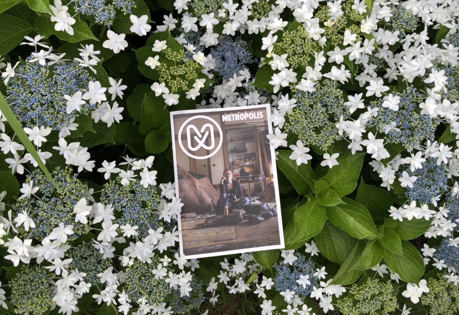
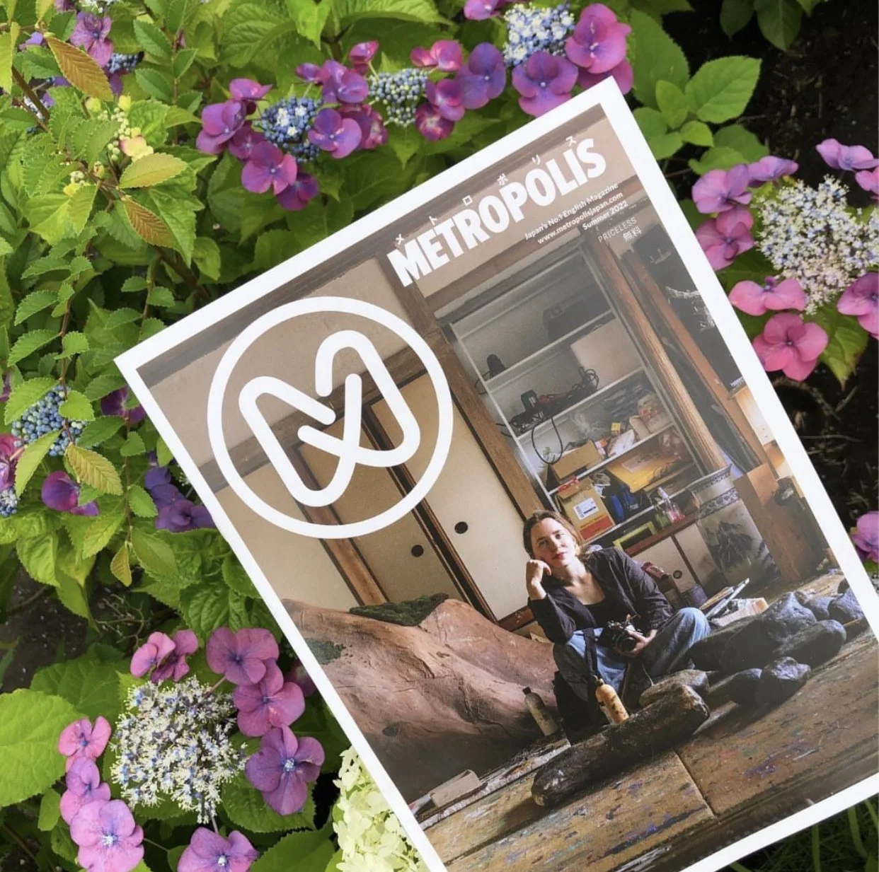
Metropolis Magazine Summer 2022 Issue
Photo by Metropolis
As Metropolis magazine’s new art director, I was in charge of designing their latest summer issue. The challenge was to bring a fresh, contemporary look while maintaining the magazine’s distinguishing visual features.
Thoughts on the Design Process
I brainstormed a design that both complemented and enhanced each individual story while also working seamlessly as a whole. As such, in this process of working at micro and macro levels, I came up with new design elements that I hope to bring back in future issues. A few of them include caption design, triangle-shaped arrows, and monochrome illustration icons (take a look at the issue and see if you can spot more). I made sure, of course, that the style of these new elements matched Metropolis’ current design.
For reference, I looked at plenty of fashion, health, business, cooking, and especially lifestyle magazines. And without a doubt, I could not leave out Japanese periodicals — the editorial design here never fails to leave me speechless. Though the Japanese writing system offers much more design versatility as opposed to the Western alphabet, Japanese magazines’ design is always eye-catching, innovative, and intuitive. Needless to say that I always had a copy of Brutus, An-An, and others at a hand’s reach right?
This was my first time designing for a publication, and I cannot say that I was not a bit frightened in the beginning. But Metropolis’ wonderful editorial team was there to support me every step of the way and make the process smoother. A big thank you to them! I learned much while working on this issue and I am committed to continuing to grow as a designer from this experience.
For more information click on the images above and follow Metropolis on Instagram and Twitter.
What’s inside this issue
With this summer’s theme being “defiance”, the writers were asked to seek out examples of perseverance and resilience in Tokyo and across Japan. We have beautiful stories like that of actress Stefanie Arianne, a Phillipino actress on a tough road to stardom in Japan, and about the recent revival of Japanese tribal tattoos. The main feature, on photographer Reylia Slaby, is a powerful reminder about the importance of staying true to ourselves and our roots, as seen through her dedication to her craft. Lastly, we wrap up the issue with a special feature (and my favorite one to design) on Fujirock and how it has never failed in its 25 years of existence to bring back generations of fans despite all the challenges faced.
You can read the online issue or find the nearest location to you where you can pick up a copy.
And be on the lookout for the fall issue this year!


With a long history of self-published creative work, Tokyo has much to offer for zine fans, from specialized stores to events and workshops.